
Quick Order
MAGENTO EXTENSION INTERFACE
A great feature for B2B digital prodcts, giving users a quick way to place large orders. The interface was outdated and ready for its next iteration.
PROJECT DETAILS
ROLE
Lead UX Designer + Project Manager
TOOLS
Sketch, Paper + Pencil, Zeplin, Basecamp
DCKAP TEAM
Andrea Sanchez, Alex Deckard, Mohan Natarajan
GOALS
Improve overall user experience. Our users were informing us of complexities around V1 of the Quickorder extension.
Areas Of Focus:
- User flow
- Redundant CTAs
- Error handling
RESEARCH
After demoing the product with the product owner to fully understand its capabilities, we went on to test the top two competitive solutions available.
TakeAway
Order placement is a straightforward task. There are three methods provided to do this but the existing UI has far too many possibilities within its user flow. An excessive amount of competing CTAs, many of which are unclear or redundant, create confusion.
TASK ANALYSIS
TAKE AWAY
Once an Item is populated to the form, the next steps are confusing. There are 6 different CTAs, all styled identically. For example, ‘Add Item’ only adds a blank field to the form. The options provided outnumber use-cases so should be reduced.
DESIGN
WIREFRAMES
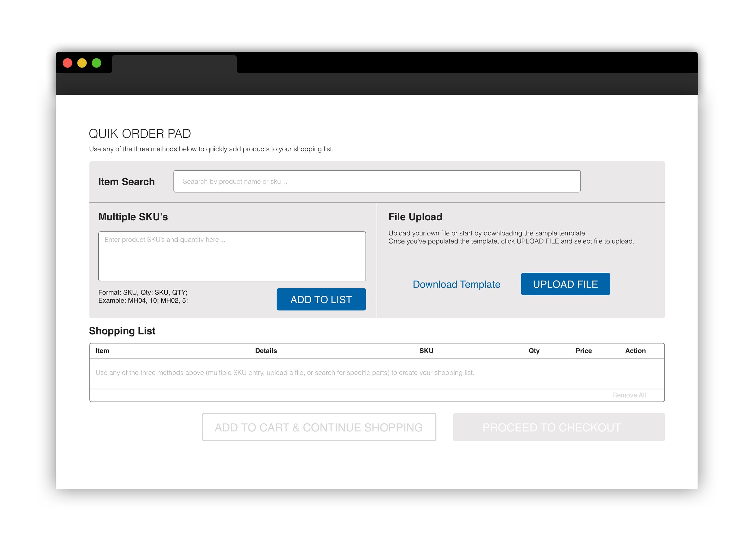
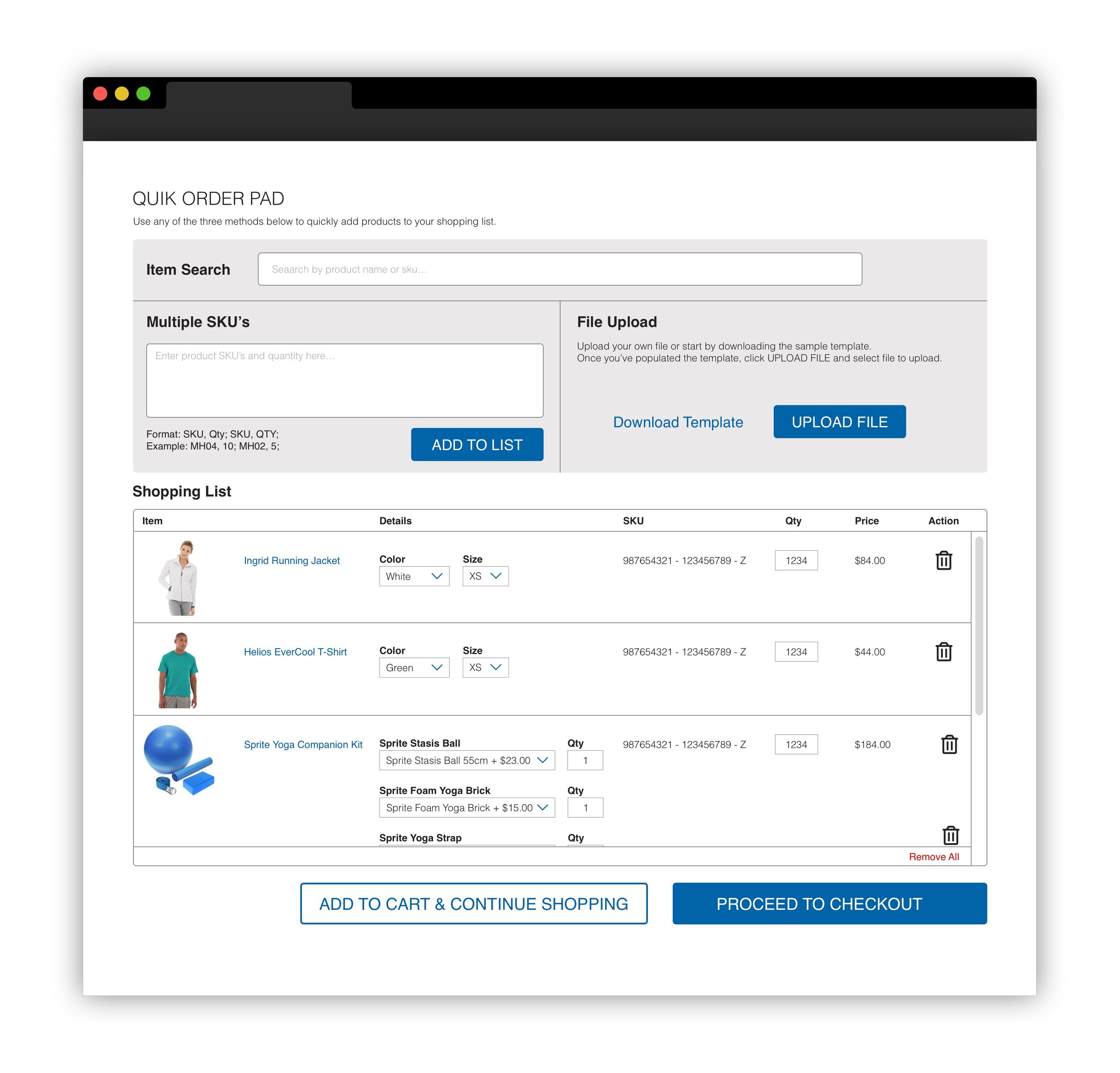
To keep the checkout CTA’s above the fold, we contained the Purchase List within a scrolling window. The individual item search was directed to be placed as close as possible to the Shopping List but we learned that it gets the most use so placed it at the top of the page giving it priority.

ATOMIC DESIGN SYSTEM
I established design elements following atomic design principals to build out the user interface. The styling needed to adapt to any branding so the interface couldn’t rely on specific colors.