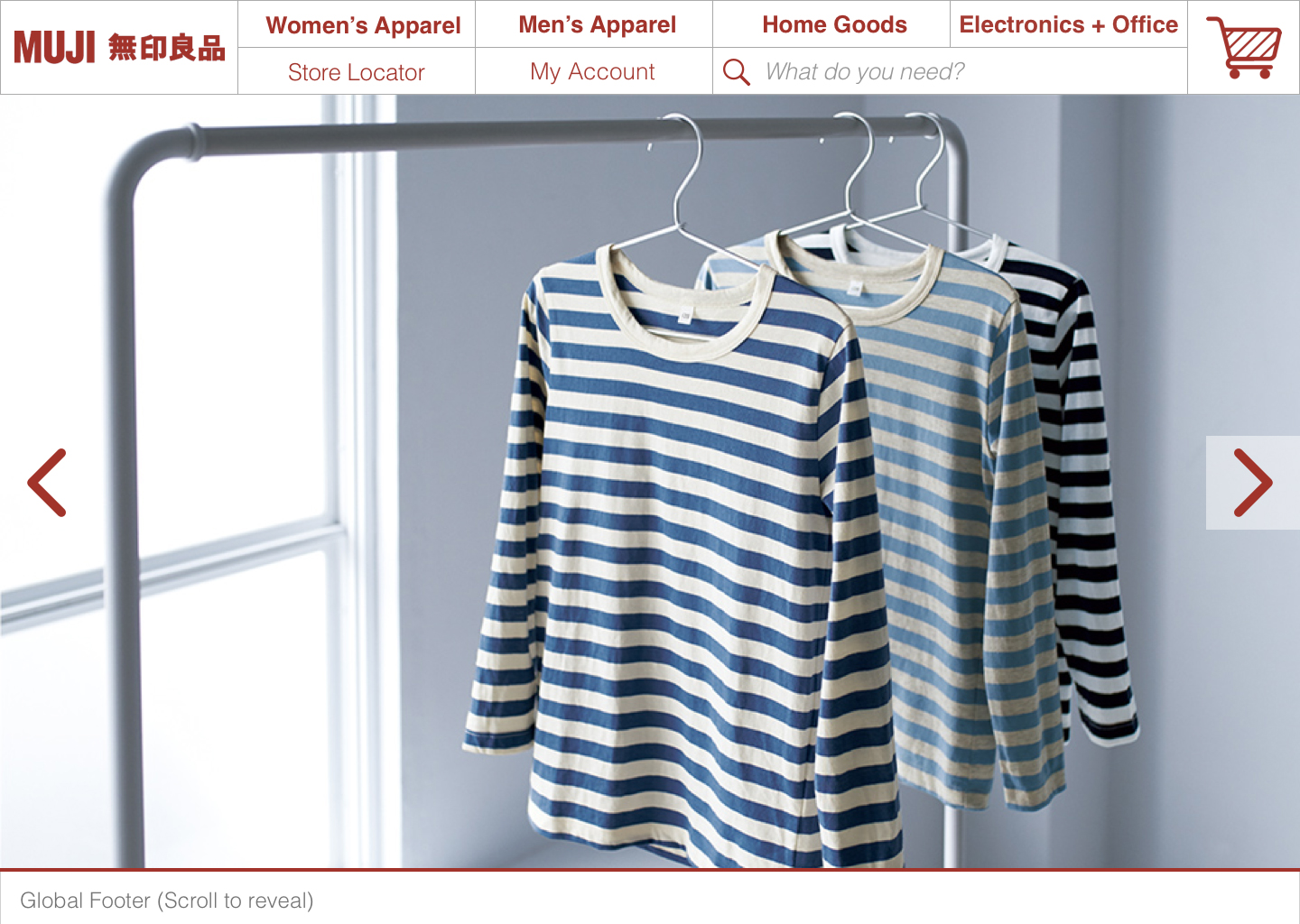
Muji
RESPONSIVE ECOMMERCE CONCEPT
Muji is a Japanese retailer whose minimalist styling communicates simplicity and organization but their domestic US web store does anything but convey this identity. This concept redesign aims to change that.
PROJECT DETAILS
Role: User Researcher, UX + UI Designer
Tools: Illustrator, Photoshop, InDesign, Sketch, Atomic.io, Paper + Pencil
GOALS
Better communicate Muji's brand identity to users.
Create a responsive web design; desktop/mobile.
RESEARCH
USER PERSONA

Takeaway
Users need to be able to quickly navigate and complete their purchase, otherwise they are likely to bounce with a full cart.
USER STORY
I need to quickly find what I need and checkout without much effort.
CARDSORT
To create a more universally understood category taxonomy, I conducted card sorts. The category titles were up to the user to define allowing them to work without suggestion or influence from from my perspective.
Here are examples that display some universally agreed upon aspects but also some interesting outlier data. Notice the creative category headers user #2 came up with. Though this is direct user date, it’s best practice to not use ambiguous or subjective category names. The ideas of what is a necessity or a luxury differs greatly from one person to the next so this particular piece of information was not considered.

UPDATED SITEMAP
The update is set up simply with a single level of navigation below the top-level parent categories. Filters are used to further narrow down products. For example, if a user wants to find Women’s T-shirts, they will navigate as follows…
WOMEN’S APPAREL -> Tops, filter product listings for T-Shirts.
DESIGN
Mobile First approach
MOBILE HOME PAGE
Existing

Redesign

WIREFRAMES

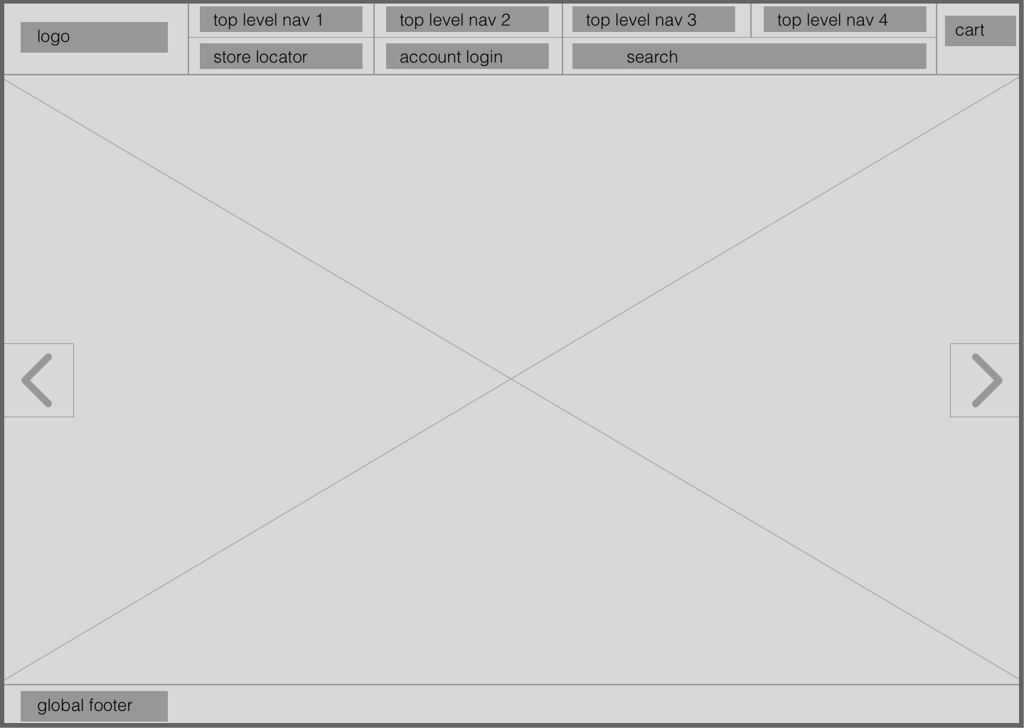
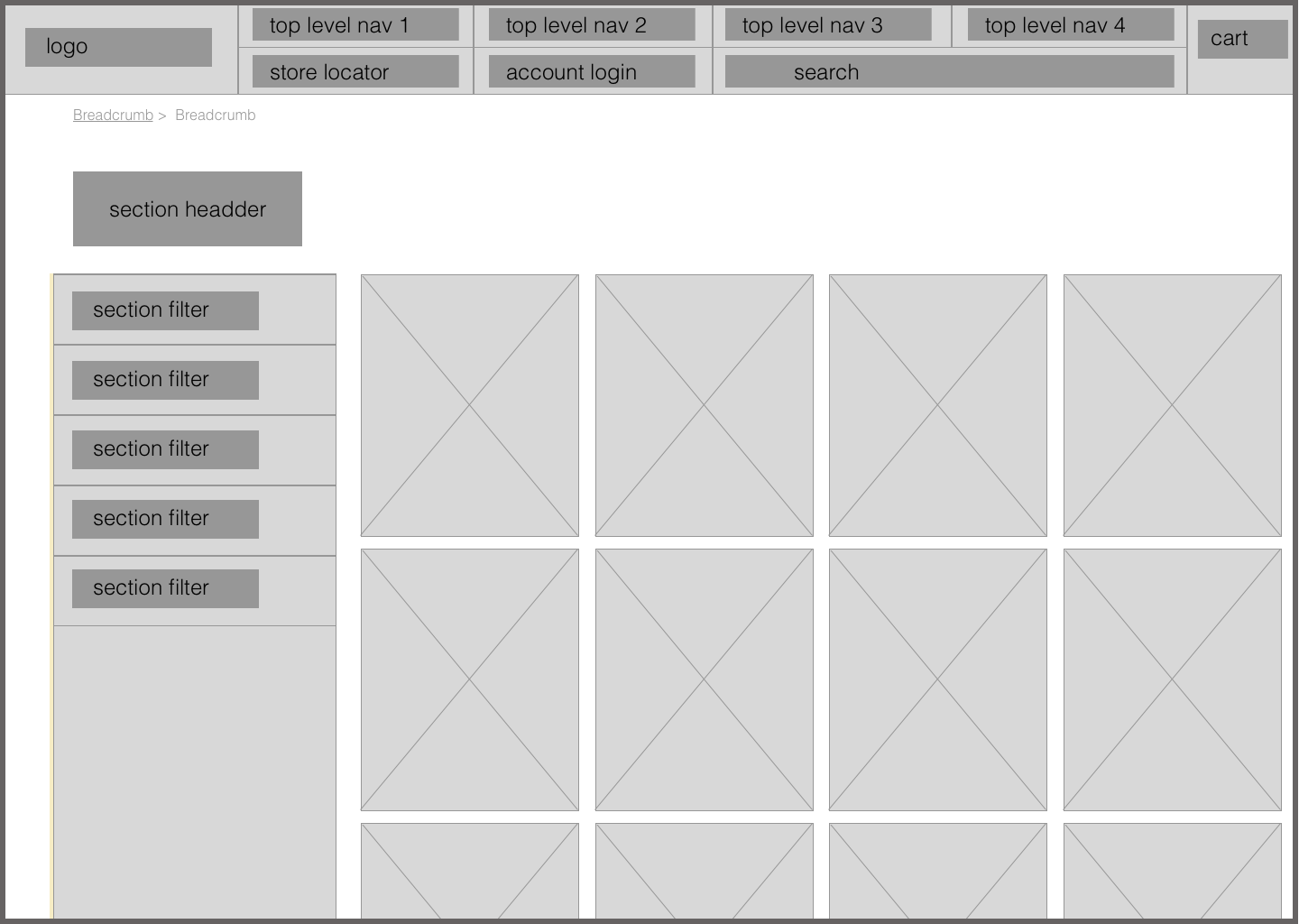
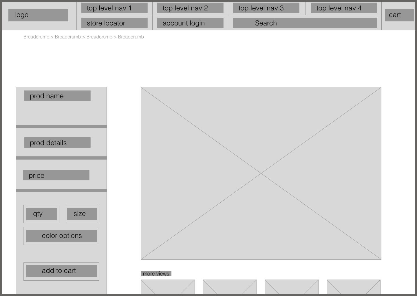
DESKTOP HOME PAGE
Existing
Redesign
PROTOTYPE
Created in Atomic.io