Viking
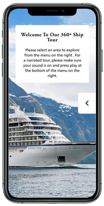
360° Ship Tours
Our existing product had a clunky & dated interface, it didn't function on mobile or Tablet and was buried deep in the site. Analytics were very low for a site that sees three-million guests a month.

Our existing product had a clunky & dated interface, it didn't function on mobile or Tablet and was buried deep in the site. Analytics were very low for a site that sees three-million guests a month.
ROLE
UXR + Lead UX + UI Designer, QA
TOOLS
Sketch, abstract, Figma, Jira
ENGINEERING TEAM
Moving-Pictures.com
Peter Sailer, Lorenz Ringz, Thomas Weinholzner
INTERNAL PROJECT TEAM
Joseph McGough, Michael Bobrowski, Garima Aggarwal, Marcel Doornbos
PROJECT GOALS
Create a more modern and simple interface.
Position more prominently within category taxonomy/site architecture.
Include Tablet and Mobile functionality.
PERSONAL GOAL
Push this impressive feature internally to be leveraged in various marketing campaigns.
Stakeholders (CEO & PM) and internal team did initial heuristic evaluation identifying numerous challenges and pain points.
Visually outdated and confusing UI
“What do these buttons do?”
Panoramic fisheye navigation thumbnails unclear
Various ADA concerns (contrast & play/pause)
No visual identification of where user is on ship
Navigation bugs
Starting with V1, and understanding the stakeholder’s concern to modernize and simplify the interface, we leveraged an existing template that utilized an accordion navigation which the Moving pictures team already had created. This would allow us to focus design efforts on the other areas of the 360° Ship Tour such as the control panel and usability research and testing.
Initial Design
Redesign
Once I mocked the three viewports and had stakeholder approval, I built a few prototypes to validate some concepts.
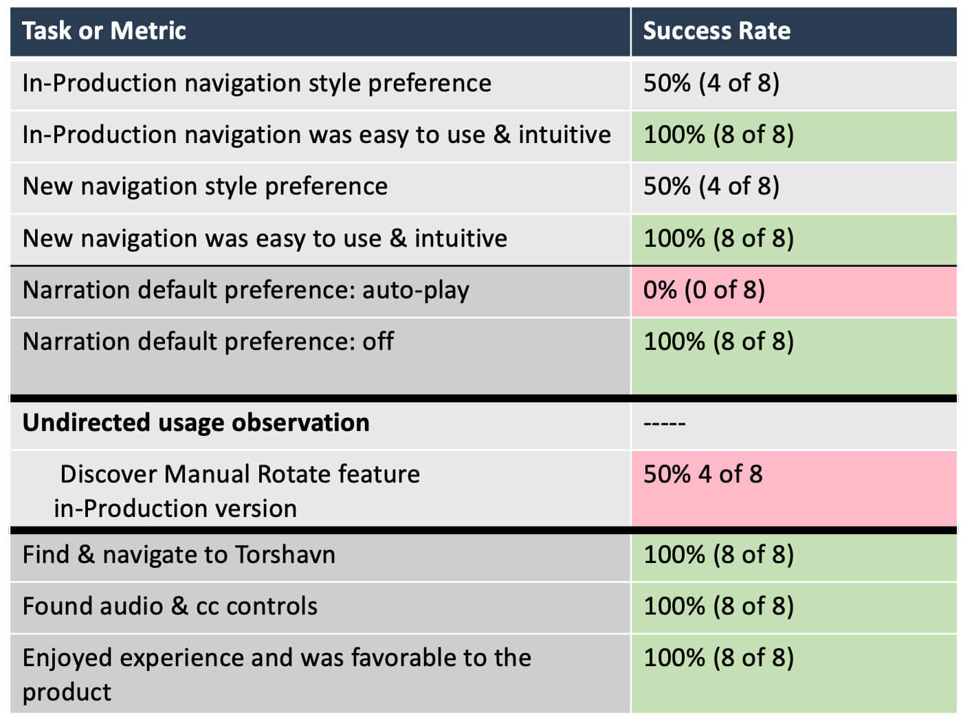
The first test was on mobile, to determine if users would discover the navigation menu tray on the right side of the screen. There was stakeholder concern that defaulting the menu to closed would adversely affect usability.
85% of users used navigation menu, completing the task within 30 seconds.
Some users tried tapping on ship image prior to accessing the nav tray.
We identified a few aspects we needed to get better insight on so set up what ended up being a few rounds of desktop testing.
Will users discover all possible functionality, or at least find help to guide them if they do not discover functionality? There is strong debate over auto playing music and auto rotation of the screen. Since the auto rotation of the screen would require additional controls (play/pause) which we don’t want to include in this phase, “How will the users know the product can pan around 360° if we don’t show them that it rotates [by way of a slow auto rotation the screen]?”
Validate concept
Unprompted discovery of the manual pan function without trouble or frustration: 90%
There was some trouble finding & confusion around the onscreen arrow navigation.
Found audio and cc controls without prompting: 100%
A/B Test
Navigation style preference was split 50/50
Preference towards no auto-play narration, default as off: 100%
Users who experienced the auto rotating product didn’t ever discover the manual pan feature: 50%
“I wish it would rotate faster”