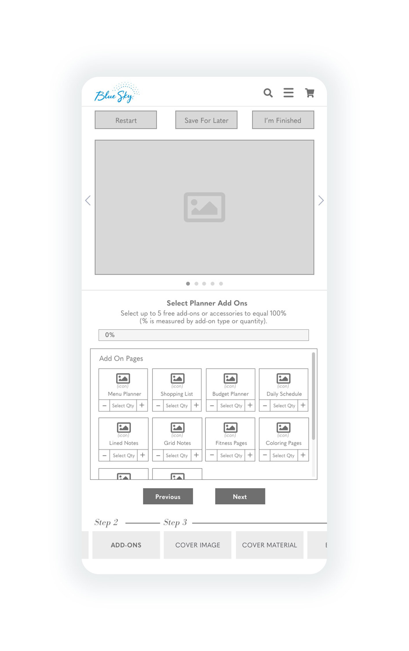
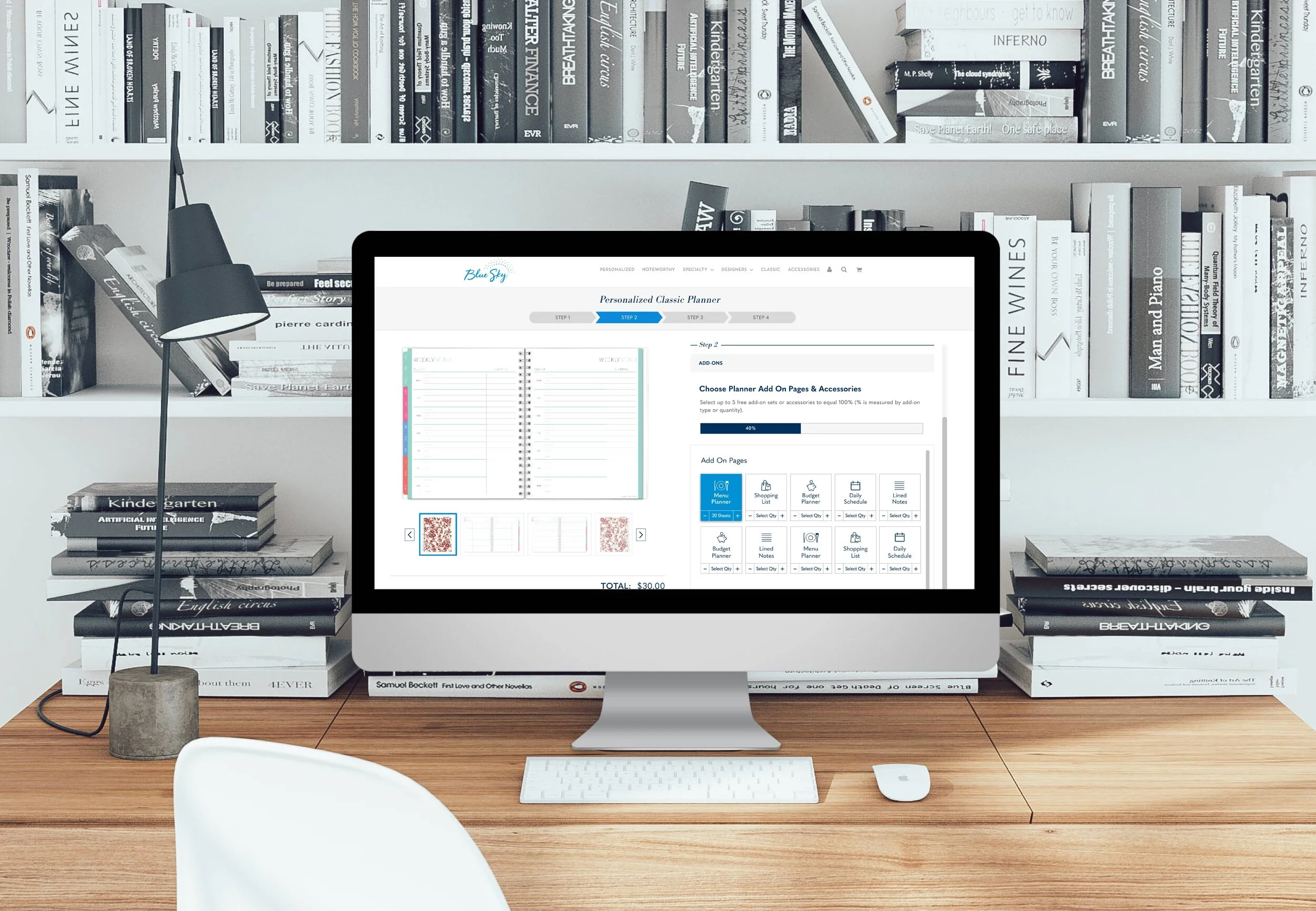
BLUE SKY

PRODUCT CUSTOMIZATION INTERFACE

Offering personalized versions of planners and notebooks that millions of people use on a daily basis, Blue Sky wanted to improve the user flow and experience of their customization platform. Launched February 2019


PROJECT DETAILS


ROLE
Lead UX + UI Designer

TOOLS
Sketch, Invision.Studio, Pencil + Paper, Basecamp, Zeplin

DCKAP TEAM
Mohammed Anees, Andrea Sanchez

CLIENT TEAM
Wes Toyofuku, Kendra Ford, Charity Fortajada


GOALS


PROJECT GOALS

More clearly guide user through user intuitive flow.

Reduce cognitive load by streamlining interface and better communicating features & options.

Introduce iconography for scan ability.


PERSONAL GOAL

Leverage more UX tools in design process.

Address mobile interface despite client descoping - This will allow us to increase our value to this client partner.


 RESEARCH

DATA

Client team summarized customer service case info, heat map, and screen recording notes to identify where to focus our efforts.

TAKEAWAY

  • Users are unknowingly skipping steps.

  • Users are hunting around page to navigate.

  • Navigation should not take users attention away from the customization process.


HEURISTICS

Becoming the user… after spending some time creating a planner, several obvious issues surfaced.


TAKEAWAY

  • Navigation is disparately located in several areas of screen, resulting in an increased cognitive load and confusion.

  • UI doesn’t establish navigational hierarchy.

  • CTA styling is not consistent.

  • Unclear copy.


TASK ANALYSIS

Personalized Task Analysis Copy_ltG_1x.jpg

TAKEAWAY

Personalizing the cover, the most emotional part of the customization, is buried in the middle of the process.

What appears to be an “Add to Cart” CTA is actually a header and doesn’t add anything to the cart. It takes the user to a customization review step.


USER FLOW

UserFlow_Double_1x.jpg

Client Directive

What makes this product different from their other customizable planners is the personalization of the cover, and the emotional connects that get created when a user sees their chosen image on the cover so after. doing some gorilla research to confirm, this step was placed as close to the beginning of the process as possible. Client ultimately felt the interior options of the planner were more important so should be presented before the cover customization.


DESIGN


Starting with V1, and understanding the stakeholder’s concern to make customization options more visible, I mocked up a concept. Again conducting gorilla testing to validate before presenting to stakeholders. Internal product owner and engineers signed off on the design concept which was then presented to and approved by the client.


Initial DESIGN

V2 Redesign


DESIGN STUDIO

Once desktop was signed off and passed to the engineers, I was given the OK to tackle mobile. Conducting a design studio with our UI designer, we did two rounds of design and critique to quickly work through different interface concepts before deciding what to move forward with digitally.

notepad_sketch_bluesky_cropped_60%.jpg
 

WIREFRAMES

Since a style guide was already created, I worked in mid-fidelity.


Mobile would need to be approved with various stakeholders so I started in low-fidelity.


PROTOTYPE


Prototype #1

To communicate the animation of the horizontal scroll to the dev team. Created in InVision.Studio


Prototype #2

Bringing the user flow & transition animations to life across two customization steps, product type and size.