
Toyota
Vehicle Configurator
With 3.3M monthly visitors, Toyota's configurator needed a fundamental rethink of how vehicles and their options are presented to shoppers.
31%
Increase in Build Completion Rate
PROJECT DETAILS
ROLE
UX Design Lead
CREATIVE TEAM
Brady Tuazon, Stevie Spencer, Jamie Sun
TOOLS
Figma, Principle, Jira/Confluence
ENGINEERING TEAM
iCrossing.com
Stephen Menesick, Josh Spears, Sean Shedlarski, Grace Huang Ditsworth, Nagender Singh
GOALS
PROJECT GOALS
Redesign the Build & Price tool to increase education and engagement for upper-, mid-, and lower-funnel users.
STRATEGY
Educate, show users what’s possible with each vehicle, so they can choose and configure with confidence..
PERSONAL GOAL
Analytics showed trim selection was a major bounce point. Users couldn’t tell what separated one trim from another, so many left before they ever began configuring. My goal was to give them a clear, effortless starting point.
PROBLEM
Assembly Required
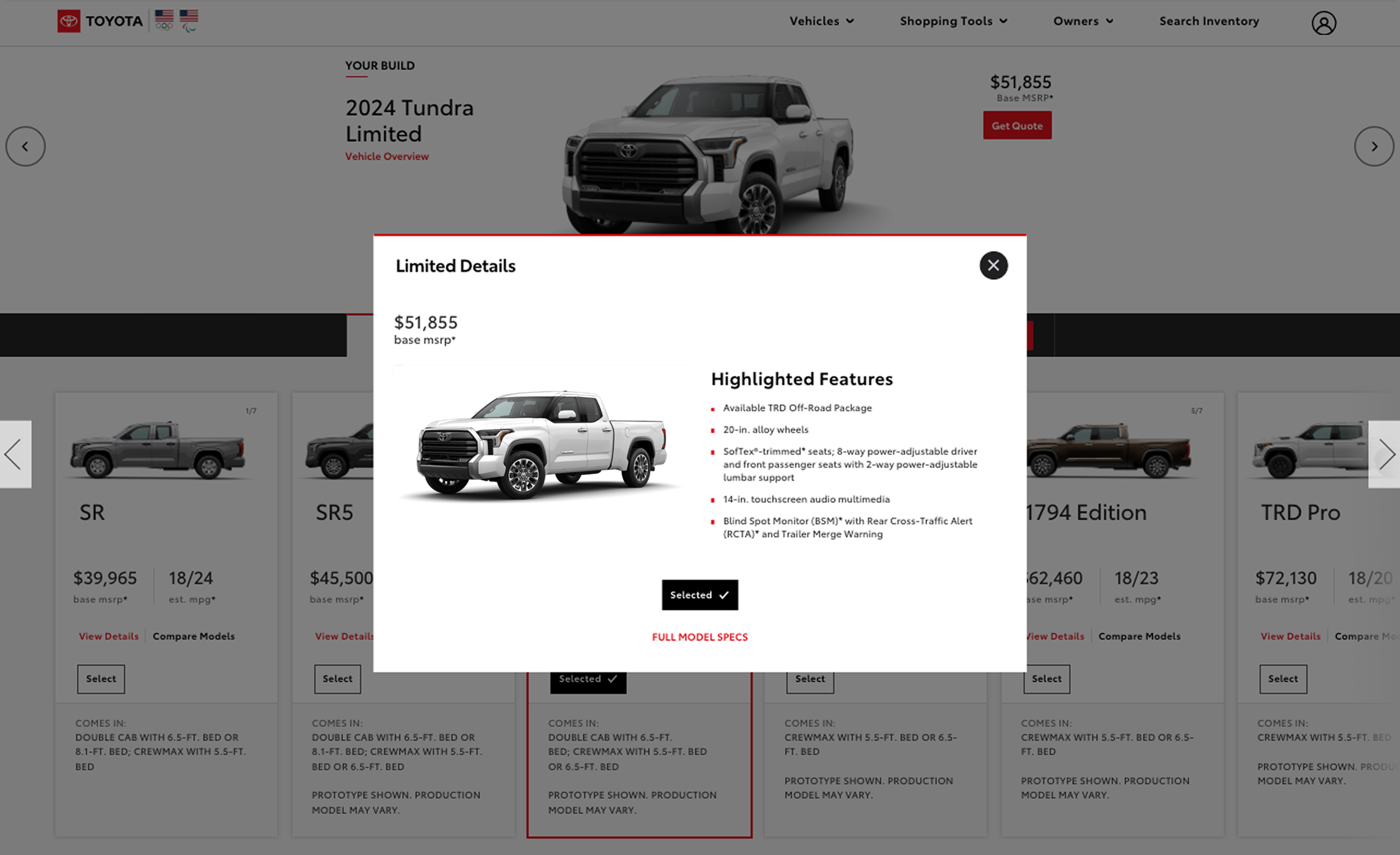
Users had to open modal after modal to piece together the full picture. Unable to find the features they wanted, many bounced before getting past trim selection.
What shoppers kept asking
Which trims have Apple CarPlay?
I want a moonroof and heated seats.
What's the difference?
Recurring themes from usability sessions, paraphrased.


PROBLEM
Cognitive Overload
The original configurator was built to keep users from choosing incompatible options. It exposed every business rule up front and repeated the same labels and details from card to card, overwhelming users and leaving them to hunt elsewhere for the information they needed. And it was about to get harder: Accessories were set to grow from around 25 to more than 100. It needed a full rework, not a facelift.

PROBLEM
Mobile Was an Afterthought
Even on desktop, shoppers had to scroll away from the vehicle render to reach the options, losing sight of the car they were building. On mobile it was worse: users scrolled in every direction just to discover content and view their build.


THE APPROACH
Teach, Don't Sell
Whether someone was idly browsing or ready to talk to a dealer, the configurator had the same job: show people what's possible. Education was made the primary goal.
The data backed that up in a surprising way. Shoppers who ran into an incompatible combination finished their builds at a higher rate than visitors overall. Conflicts weren't the dead end everyone assumed. Handled well, they're the moment the tool teaches you something. So instead of hiding them, we leaned in.
61.2%
Completed a build after hitting a conflict
53.7%
Completed a build, all visitors
THE FLOW
User Flow Update
Moving Trim Select out of the configurator meant it no longer had to reload every option, and let us focus on trim education, right at the step where so many shoppers were bouncing.
We also split the old Engine choice into three deliberate steps: engine, drivetrain and transmission. That surfaced standout options that used to be buried in the details, like the Supra’s manual transmission.


EXPLORATION
Fresh Perspective
I designed two distinct UI patterns, plus a hybrid that straddled both, then built low-fidelity working prototypes of each to feel out how they behaved. Usability testing for these concepts wasn’t in the budget, so the team worked through the options together. The team chose v2, and the launched design is an alternate version of it.
Given the time, I’d have run unmoderated tests of each model with minimal task prompts, to see which one people moved through most easily without biasing the results.
CONSTANT ACROSS ALL OPTIONS
The Build Stays In View
Whatever the layout, one rule held in every option: the vehicle render is a sticky component, side by side with the options on desktop and stacked above them on mobile. Every choice updates the build you're looking at.
v1 Horizontal swiping interface.
v2 Vertical scrolling interface.
v3 Hybrid: horizontal + vertical interface.
Where it landed
v2 Alternate

v2 originally called for a running summary, which meant clicking through one step at a time. The alternate moved to a continuous scroll instead, removing the back-and-forth clicking.
The Build
Model Select
Before: each model year got its own card, and so did each hybrid version, so one vehicle could take up four cards and wrap to a second row.
~25%
Fewer model cards
A model-year toggle replaced the duplicate cards, so a vehicle now shows two at most: gas and hybrid. On mobile the gain was even bigger: the scroll area dropped from 67 cards' worth to 41.
The cards also got bigger, giving the content room to breathe and space for a more vibrant lifestyle photo. A new Options button flips each card to show what's available for that vehicle, so shoppers learn before they commit. The old configurator had nothing like it.
Solves · Cognitive Overload · Mobile


Page Comparison
Same Trucks filter, before and after. On the left, each model year has its own card; on the right, one card with a year toggle.


The Build
Trim Select
Moved out of the configurator and into its own step.
Before: there was no way to compare trims. Seeing what a single trim offered took the right path and several clicks, and even then shoppers were left with questions, often bouncing to the vehicle's main page or leaving the site entirely.
Now trim had room to inform. A full comparison tool was out of scope for this release, so I designed a lightweight compare that still answers questions like which trims have Apple CarPlay.
Solves · Assembly Required · Cognitive Overload


The Build
Color Select
Moved from third in the configurator to first.
Before: color came after trim and engine, so shoppers had to commit to the technical choices before reaching the one many came for.
With trim moved out of the configurator, color could lead. Research showed it was one of the most visited steps, and Toyota’s marketing team had even built a separate “colorizer” for the vehicle pages so shoppers could try colors there. Now the configurator opens on the choice shoppers were already looking for.
Solves · Assembly Required

The Build
Powertrain
Before: The “Engine” step bundled engine, transmission and drivetrain and, on Sienna, seating.
By breaking up the combinations, we created a powertrain step that was quicker to grasp for users.
We originally proposed this selected state. The MVP launched with a different treatment, and after launch the team moved to this version.
Solves · Cognitive Overload


The Build
Packages
Two fixes: the card itself, and how packages work.
Redesign
No More Overlay
Where a card had more to say, an accordion now opens in place, so shoppers never leave the configurator. Where it had nothing to add, the “See Included Features” link is hidden.
Solves · Assembly Required · Cognitive Overload


Previous: Modal
Rearchitect
No More Endless Combinations
25to7
package choices
Users were bewildered, and so were we. Just seven items were being combined in every possible way, creating 25 near-identical choices.
Switching from radio buttons (pick one) to checkboxes (pick any), with the conflict flow managing which items depend on each other, we let shoppers build their own combination. No longer was every possible combination needed.
Solves · Cognitive Overload


USABILITY TESTING
Prototype
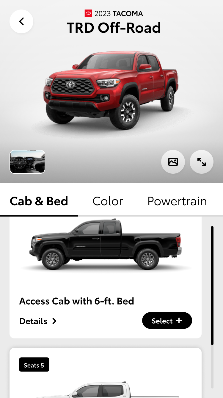
Fully functional variable prototype built in Figma for final usability testing. Prototype features include new “model compare” modal, decoupled packages, dependent packages and package conflicts, cost calculation, updated layout and animations plus functional summary page.
Try It Out
Browse trucks, build a 2023 Tacoma TRD Off-Road, trigger a package conflict (Add Audio Upgrade without Weather package), then open the summary to see the transition.
HEAD TURNING NUMBERS
The new configurator has been wildly successful. Over the first year after launch, user engagement has increased dramatically compared to the previous experience.
31%
INCREASE
Completion Rate
20%
INCREASE
Accessory Add-Ons
65%
INCREASE
Dealer Quotes
124.9%
INCREASE
Payment Estimator Usage
63.7%
INCREASE
Credit Applications
Source: TMNA Analytics Readout
NEXT UP